Information Architecture
Simplify how we get to content
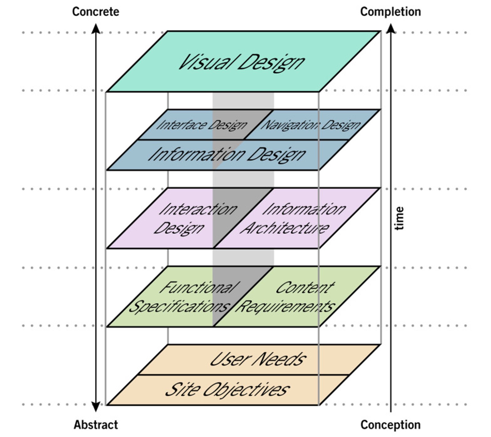
In my opinion, a milestone in the literature about web development is "The Elements of User Experience Design" by Jesse James Garret. The brilliant approach of the author has changed my way of handling projects since the day I started reading it.
Jesse James Garret divides the development process into five stages, from abstract to concrete, from strategy to product.
Right after the initial strategy phase, after collecting all the necessary elements to start structuring our application, the very first step is just information architecture.
To quickly reassume, the preliminary phase ends up identifying two lists of needs and functionalities from both stakeholders' and users' perspectives. It is actually these two lists the foundation for our future information architecture.
At the beginning of my career, I considered this phase didascalic and less relevant compared to coding, aesthetics, and to databases. I realized that was just because I was working on not-so-complex projects, and I did not realize that, subconsciously, information architecture was present in many of the choices I took around layouts, and in creating the hierarchy of elements.
Not only! I realized that many aspects of the development, including those I considered more relevant than information architecture, are better designed if they are based on a more solid, thoughtful content architecture.
The benefits are not only in a better design but also in a better user experience and definitely higher conversion. We have to remember that on the world wide web, users are already predisposed to receive the information we want to deliver, we only need to organize it in a way that makes sense. In addition, the contents we try to organize are the reasons why users use our application.
This is how Peter Morville, the father of information architecture on the web, defines this important discipline: "The structural design of shared information environments. The combination of organization, labeling, search, and navigation systems within websites and intranets.The art and science of shaping information, products, and experiences to support usability and findability."
Content
So, what is it we can define as content? Text, images, video, audio, documents. Articles, and also the title or the publication date are nodes of content that compose an article and need to be organized in a prioritized system of content, an information architecture. A product item is a content, as well as its price and discount, the description, or the PDF tech sheet. Should we display on the front page list of products that we have a new item, a last arrival, or not? These are decisions connected to information architecture that we have to consider also when the application is layout. Due to the fact that it is not only a matter of navigation it is rather an organization of messages that invite users to browse further in an effective way, in a faster way rather than in our competitor application.
Mental models
The paradox of nowadays information architecture is just that, since mobile units showed up, browsing has to be more effective. If users do not reach by a few clicks on what they are looking for, they got discouraged to continue with our application, look for someone else app, or got distracted by a push message from social media. So, the effectivity resides in serving the content in a way the users expected it to be.
Don Norman, the author of the milestone book "The Design of everyday things", mentions that: "Users spend most of their time on other sites."
It has to do with established language and mechanisms we are used to when we use an app. The anarchy we lived in during the early stages of the world wide web was useful to establish the mechanisms we are used to nowadays. The empirical way we discovered what works better, created all those mental models in the way we benefit from applications.
Mental models are subconscious expectations of our users when they approach a digital product or any other product users already experienced. Do we need to learn how a car moves forward every time we enter a new car? Apparently not, we expect to start the engine, press a pedal and use a steering wheel in order to follow the road.
At the same time, when we display an app on our devices, we aspect to initiate a dialogue with established mechanisms. To find elements we are used to: headers, menus, search inputs, support menus, footer, chat, and so on and so forth. Information architecture has to benefit from these tools to organize content. Mental models do not mean that we can´t improve those mechanisms. Technology dictates often new methods, bigger screens on smartphones force us to move away from a "hamburger" menu towards a fixed menu at the bottom of the application. That is when even more we need a better information architecture, there is not all the place we want down there on the footer of a smartphone.
In a book, I was reading lately about mental models: "The Great Mental Models Volume 1: General Thinking" by Rhiannon Beaubien, I found one of the best explanations about mental models. To conclude this part I would like to mention it. Rhiannon Beaubien to explain how mental models work, mentions a short story. "One day, a fish swimming in the sea met two younger fishes and said: hi guys, how is the water today? The younger fishes swam further and after a while, they look each other and said: what is the water?". We do not need to ask ourselves where we are and what to do when we are already used to the environment we are experiencing. This happens with applications too, something we use every day very often, and when we suppose to let our users benefit from our content, we do not need to reinvent the wheel every time.
Be careful though, mental models are a double-edged sword, and not all of our users have the same expectations and experiences. It is here, in this differentiation, that we have tolerance within which we can deliver an information architecture that is more effective than our competitors.
Methodology
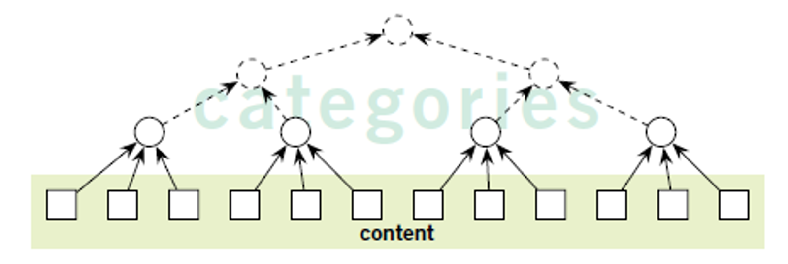
How do we get to an effective structure? If we get back to the nodes of content, all those labels we need to give sense to, we often end in a huge amount of cards. It can be challenging to combine them starting from our own point of view. Of course, we can go through some A/B tests and get closer and closer, but why not reverse the process and let users do the job?
In many previous projects in which I had to take care of the architecture of content, I used mainly to approach from my own perspective and A/B testing some solutions. Lately, in some workshops with students of Interactions Design, I had the chance to experiment with inputs from the users, from their perspective and mental models. We used a platform called Optimalworkshop in which is possible to start a so-called "study" of card sorting, launch a survey, and let the users do the sorting.
At the end of sorting, we collected more variations and solutions and our job was to analyze what was more recursive, the more frequent mental models. It is indeed enough with no more than ten responses to come to a proper solution.
Optimalworkshop allows us to decide on categories in advance and ask in the survey to place labels into those categories. We can also launch a hybrid survey in which we predefine categories but we let also users change it and create their own. Or, my favorite approach, is to give full freedom to sort labels to users, without spoiling results in any way.
Building structures
By sorting labels we end up with cards grouped together in small medium collections. These collections have a title to distinguish and identify what is the relation between the cards. Here must we take a compromise between all cards and the groups, those cards generate. The thing we have to take care of here is not to overpopulate collections with cards but at the same time, we can´t generate too many categories.
A rule leads us during this process, the rule of magic number seven. According to this "short memory storage" rule, most adults can store seven items, plus, or minus two. There were several scientists who studied this phenomenon during the last decades of the previous century. I do not want to mention now all these studies, but what is relevant for us now is that in information architecture, the ability to summarize and categorize is the key to a successful result.
What we might end up with at the end of this process is a top-down or a down-up skeleton, it all depends if we start from specific labels, that is the case of an e-commerce,
or we start with a list of functionalities and needs, top-down approach.

In both cases, the skeleton might be open to scalability, an easy way to put in new items at each level.
Final user testing and refine
Even though we went through A/B tests and ponder our solution, a user test would confirm on we are on the right track. We should now run a Treejack test.
The same platform I previously mentioned, Optimalworkshop, can help us with this test. We can start a new study of type Treejack. Launch the survey by asking to find some of the menu items in our structure. After this test, we often realize which elements are placed in a weak position and we have therefore a chance to place them in a more appropriate position.
Visualizing
It is time to recap and visualize what the refined structure looks like, it is time to draw a diagram that visualizes the result.
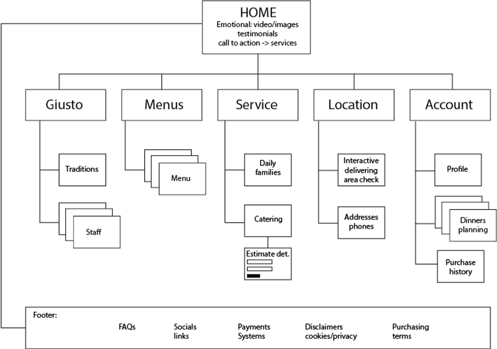
This diagram summarizes where categories, labels, and amount of cards in each category. Not only, it also shows the priority of the categories in a sort of draft layout that benefits from the header, footer, and support menu and gives the proper priority to our information architecture.
Conclusions
In this short article, which deals with a complex argument, I summarize the steps and the challenges we have to deal with information architecture. What is important to remember is that a successful structure of the content is a winning key for a digital product. Users of digital products are already predisposed to find what they are looking for and what they need is a structure that makes sense. This means higher conversion and less bounce-rate.
Photo: Carlo Alberto Burato