Typography and web
An ancient discipline for a modern technology
Dealing with font and text in web applications involves various crucial factors, including design choices, visual identity, and overall aesthetic appeal. Additionally, it demands adherence to WCAG guidelines to ensure accessibility and involves employing effective writing techniques to align with search engine requirements.
In general, typography supporting texts is a fascinating discipline, and mastering such a complex technique requires high competencies.
What we manage to communicate with texts is consolidated over centuries and the experience of editing books, magazines, and graphics posters. With texts, we developed the ability to communicate messages and knowledge of any kind.
The World Wide Web emerged in the 1990s, introducing a groundbreaking concept that revolutionized communication by enabling faster and more extensive connectivity compared to the media platforms of the past.
The same main technology of this world wide web idea, HTML, means actually Hyper Text Markup Language, revealing that the fundamental of WWW is, primarily, to connect text in the hypertextual mode. And the infrastructures and technologies of the very early days of WWW were forced to privilege texts as the main media for inferring messages and concepts through the web.
In the same early days, the wish to transfer typography from desktop graphics to the world wide web was very clear. Whenever we wanted to use elaborated typography on the web, in that initial, anarchist scenario, the first approach was to create texts with pictures and use all those type-faces used in the graphics design discipline. That was a scenario that did not consider accessibility at all. Nowadays that approach would have breached at least two rules: a WCAG accessibility rule which considers all is written in an image as not accessible by screen readers. In addition, search engines would not be able to index a page with texts written as images.
But screen readers and search engines were not yet in that scenario so the approach worked fine for a while.
We had to wait some time before the market and technology has given developers the chance to implement typography on the web in a more organic way. First the introduction of @font-face in CSS and the implementation of fonts formats, woff, and woff2.
Then in the 2010 year the first attempt to introduce the Google Fonts service. Not a big success at first but, after a revamped around 2011 is the time right to make a success out of it.
The effort to accomplish this need is oriented in different directions. Web applications need to be indexed by search engines, which need to know what the application is about, and therefore texts need to be readable by bots. The texts need also to be accessible to all users. Some of the users have difficulties reading due to reduced physical functions and screen readers have to do that for them. Screen readers need text to read not images. We need to be able to increase the size of the text in the interfaces, WCAG 2.1 says up to 400%.
Last, but not least, the variety of fonts to choose from, gives designers and developers the chance to give identity and tone to web applications without breaching any rules.
The shape and anatomy of a font-face are not only relevant to establish an identity and a tone. A shape of a font might trigger a level of readability that in digital platforms can be very relevant for the success of the application itself.
At the beginning of the web, there was an idea that san-serif typefaces were more appropriate for reading on the screen, and serifs suited best for print. Research demonstrates that is not the shape that increases readability but other factors. Fortunately, these factors are under the control of developers and many of them are law regulated so we need to ensure they are in place when we launch an application.
The first thing we have to check is the contrast between the text and the background. It varies in relation to the font size and the aspects (bold, semi-bold, normal), but the minimum contrast between text and background is 4,5:1. Many tools give us the chance to measure this value, I easily remember contrast-ratio.com but there are plenty of these tools.
Another parameter that influences the readability of web applications is the leading of the body text. In desktop graphics, the leading is the distance between the lines of the text. The style sheet property corresponding to the leading is the line-height and it has to be at minimum one time and a half the size of the font. For example, if the font size is 20px the line-height should be set to 30px.
A strong requirement of the WCAG (Web, Content, Accessibility, Guidelines), is to ensure the application zooms up to 200% (WCAG 2.0) or even 400% (WCAG 2.1). We have two ways to zoom in on an application running in a browser. The first way is to use the zoom of the window (ctrl+, command+), and this will not represent an issue for the code, since it operates directly on the dimension of all elements of the interface, including the text.
The other way to zoom in is through the settings. Users with reduced vision functionalities, normally, set the dimensions of the font-size to big or extra big, in order to avoid zooming in and out all the time every time they enter applications.
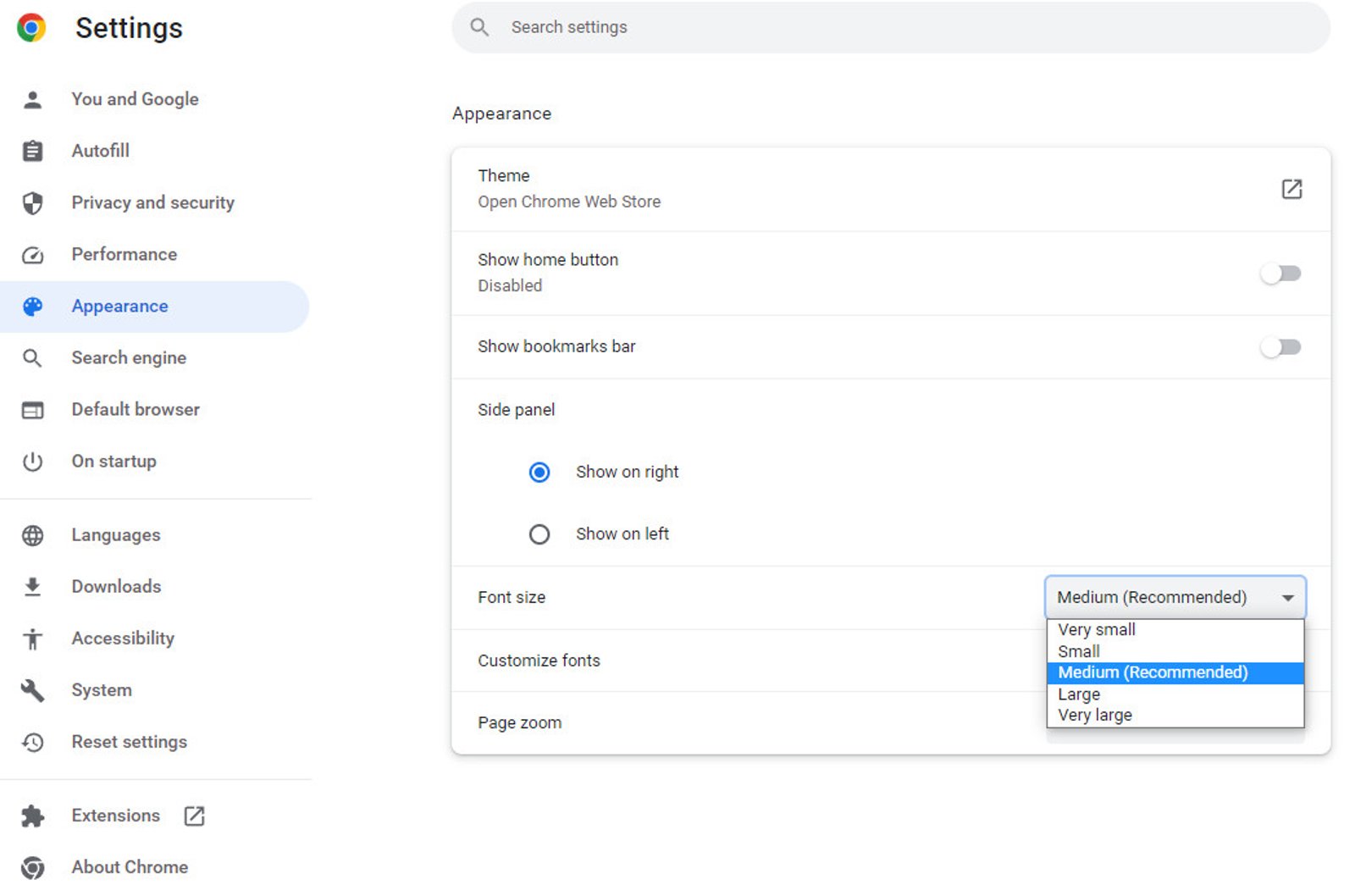
When users change these values, from medium to large or extra-large, the base font-size value for the browser changes. The medium size is 16px, in large the size is 20px and in extra-large 24px, but those sizes are customizable, at least in Chrome
What this technically means is that the HTML selector of the style-sheet gets per default the value from these settings. So if we do not define any font-size in that selector the font-size is either 16px or 20px or 24px. So if we continue to work with rem units in the rest of the style-sheet, 1rem still relates to the value inside the HTML selector which dynamically can change according to what the user chooses on browser settings.
In this way, we do not breach any WCAG rule about zooming in applications. In case we want to manipulate the relationship between the rem unit and HTML selector value we have to continue using dynamics values in percentage for example like this:
html {
  font-size: 125%;
}
.body-text {
  font-size: 1rem;
}
In this example, considering the font-size set to medium in the settings, and therefore 16px, that value becomes 20px in the HTML selector (16px multiply 120%), and then the font-size in the body-text class result as 20px since it is 1rem and rem units always refers to the root value which is set in HTML selector.
Long story short, the golden rule is never to set a font-size in the HTML selector to pixels, but always keep it dynamic.
Scale with a rule
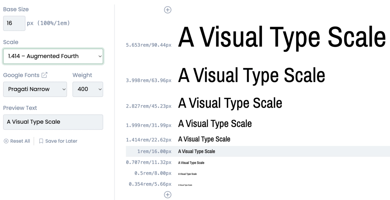
Moving out from rules and duties, and getting into aesthetic aspects, I would like to suggest a good practice when it comes to building a design system for font sizes. I use to support my size choices by following a specific rule inherited from desktop publishing, rules of Major second, Minor second, Golden ratio, what suited better the look and feel of the project. To achieve faster these sizes, consider using typescale.com to get access to the right size in the unit you are most familiar with.
Respect the type-face
One last piece of advice for this quick list of considerations about typography on the web is: to respect the font-face you are working with. This means less use of letter-spacing as possible, and all other alterations of the font in terms of aligning and kerning.