Intrinsic webdesign
Letting the Browser Do What It Was Built to Do! On Jen Simmons, CSS Grid, and the End of Fighting the Medium
I've been following Jen Simmons's work for years, and what keeps drawing me back isn't just her technical contributions — though those are substantial — but the clarity of the idea behind them. As a member of the CSS Working Group, she's been instrumental in pushing the language of the web toward something more capable and more honest. But what distinguishes her work from the broader CSS evolution is the philosophy that drives it. She isn't just adding tools to the toolbox. She's arguing for a fundamentally different relationship between designers and the medium they work in.
I both envy and admire her eloquence. The ability to articulate a technical vision in terms that resonate beyond the technical community is rare, and Simmons has it in abundance. When she speaks about the web, she speaks about it as a material — something with inherent properties, natural behaviors, and latent potential that most of us have been suppressing rather than embracing.
That idea — the web as a material with its own nature — is the foundation of what she calls intrinsic web design.
The Problem With Forcing the Web Into Boxes
To understand what intrinsic web design is solving, you have to understand the problem it's responding to. And that problem has been hiding in plain sight for the entire history of CSS.
From the earliest days of web layout, designers have been fighting the medium. The web is fluid by nature — an HTML document, unstyled, will reflow to fit any viewport. Text wraps. Content stacks. The document adapts. This isn't a limitation; it's a fundamental characteristic of the medium. The web was designed to be flexible because the web was designed to be universal — accessible from any device, any screen size, any context.
But designers, trained in print and fixed-canvas media, looked at that fluidity and saw chaos. They wanted control. They wanted to specify exactly where every element would appear, at what size, in what proportion. And so began two decades of increasingly elaborate techniques to force the web into fixed layouts. Table-based layouts in the late 1990s. Float-based layouts in the 2000s. Absolute positioning hacks. Clearfix tricks. Pixel-perfect specifications that assumed a fixed viewport width — first 800 pixels, then 960, then 1024 — and broke spectacularly on anything else.
Responsive web design, introduced by Ethan Marcotte in 2010, was a genuine breakthrough. The idea of using media queries to apply different styles at different viewport widths meant that a single codebase could serve multiple screen sizes. But the implementation, in practice, reinforced a particular mindset: design a fixed layout for desktop, design another fixed layout for tablet, design another fixed layout for mobile, and use breakpoints to switch between them. The content didn't flow. It was rearranged, three or four times, into three or four predetermined configurations.
This was better than what came before. Significantly better. But it was still, at its core, an approach based on control rather than adaptation. The designer was still deciding, in advance, exactly how the layout should look at specific widths. Between those breakpoints, the content either squeezed or stretched uncomfortably. And every new device category — foldable screens, ultra-wide monitors, watches, car displays — demanded new breakpoints, new configurations, new decisions.
The designer was still fighting the medium. Just fighting it more cleverly.
What "Intrinsic" Actually Means
Intrinsic web design begins with a different premise. Instead of imposing predetermined layouts at fixed breakpoints, it designs systems that respond to the inherent properties of the content and the available space. The layout isn't specified; it's described. The designer doesn't say "at 768 pixels wide, switch to a two-column layout." The designer says "each item needs at least this much room to be legible, and the layout should use whatever space is available to arrange them optimally."
The distinction is subtle in description but dramatic in practice.
In a traditional responsive approach, the designer is making decisions on behalf of the browser. They're predicting what viewport sizes will be common, defining breakpoints for each, and specifying layouts for each breakpoint. The browser's job is to execute those instructions faithfully. It's a command-and-control relationship: the designer commands, the browser obeys.
In an intrinsic approach, the designer is delegating decisions to the browser. They're defining constraints — minimum sizes, maximum sizes, proportional relationships, content priorities — and letting the browser figure out the optimal layout for the current context. The browser becomes an active participant in the design process rather than a passive renderer of predetermined instructions. The designer provides the rules. The browser applies them to whatever reality it encounters.
This isn't laziness or abdication. It's a more sophisticated form of design — one that acknowledges that the browser knows things the designer doesn't. The browser knows the actual viewport width, the actual font size the user has configured, the actual pixel density of the screen, the actual amount of content in each container. The browser has access to the runtime context in a way that no static design specification ever can. Intrinsic web design is the practice of giving the browser enough information to make good layout decisions, and then trusting it to make them.
The result is layouts that don't just respond to breakpoints but continuously adapt to any context — any viewport width, any content length, any font size, any combination of variables that the designer couldn't have predicted in advance.
Progressive Enhancement: The Ethical Foundation
Before diving into the technical implementation, it's worth pausing on a principle that undergirds the entire approach: progressive enhancement.
Progressive enhancement is the practice of building a baseline experience that works for everyone — every browser, every device, every connection speed, every ability level — and then layering additional features and refinements on top for environments that can support them. It's the architectural inverse of graceful degradation, which starts with the full-featured experience and tries to prevent it from breaking on less capable devices.
The distinction matters because it determines who gets left behind. Graceful degradation starts from the most capable environment and works downward, which means the least capable environments — older browsers, slower connections, assistive technologies — get whatever's left after the full experience has been built. Progressive enhancement starts from the least capable environment and works upward, which means every user gets a functional experience, and users with more capable environments get an enhanced one.
Intrinsic web design inherits this principle naturally. When you define a layout using flexible constraints rather than fixed specifications, the layout adapts to what the browser can support. A browser that understands CSS Grid renders the full grid layout. An older browser that doesn't falls back to the natural document flow, which — because the web is fluid by default — still produces a usable experience. The content is still there. The hierarchy is still intact. The user can still accomplish their task. They just don't get the optimized layout.
This is the ethical dimension of intrinsic design: by working with the medium's natural flexibility rather than against it, you ensure that the baseline experience is always functional. Enhancements are additive. Nothing breaks for users whose browsers or devices can't support the latest CSS features.
Flexbox: The Wrap That Changes Everything
The simplest practical demonstration of intrinsic web design involves a technique so straightforward it almost feels like cheating. And that's the point — when you stop fighting the medium, the solutions become simpler.
Consider a common layout problem: a row of cards — product tiles, feature highlights, team member profiles, whatever the content may be. In a traditional responsive approach, you'd define a grid at desktop widths (four columns, perhaps), add a breakpoint at tablet widths (two columns), and another breakpoint at mobile widths (one column). Three layout specifications, two breakpoints, all hardcoded against assumed viewport widths.
With Flexbox, the intrinsic approach collapses this into two properties.
By default, a flex container arranges its children in a row with nowrap behavior. This means that as the viewport shrinks, the items compress horizontally — they get narrower and narrower, trying to stay on a single line. The content inside them crumples. Text stacks into unreadable columns. Images shrink beyond recognition. The layout is rigid where it should be flexible.
The fix is to tell the container to wrap, and to tell the items how much room they need:
.flex-container {
display: flex;
flex-flow: row wrap;
justify-content: center;
}
.flex-item {
min-width: 12rem;
flex: 1;
}
That's it. No media queries. No breakpoints. No assumptions about specific viewport widths.
Here's what happens at runtime: the browser lays out as many items as will fit in a single row, given that each item needs at least 12rem of horizontal space. When the viewport is wide, all items fit on one line. As the viewport narrows, the moment there isn't enough room for an item to maintain its minimum width, it wraps to the next line. The remaining items on the first line expand to fill the available space (thanks to flex: 1). The layout reconfigures itself continuously, at every pixel of viewport width, without a single breakpoint.
The designer defined two things: the flow direction (row, wrapping) and the minimum comfortable width for a card (12rem). The browser handled everything else. It calculated how many columns fit at the current width. It determined when to wrap. It distributed the remaining space proportionally. Every one of those decisions was made at runtime, with perfect knowledge of the actual context, rather than at design time with imperfect assumptions about possible contexts.
This is what intrinsic means in practice: the layout's behavior emerges from the constraints, not from explicit instructions.
CSS Grid: The Full Expression
Flexbox handles one-dimensional layouts elegantly, but CSS Grid takes intrinsic design into two dimensions with even more expressive power. And the key technique — the one that most directly embodies Simmons's vision — fits in a single line of CSS.
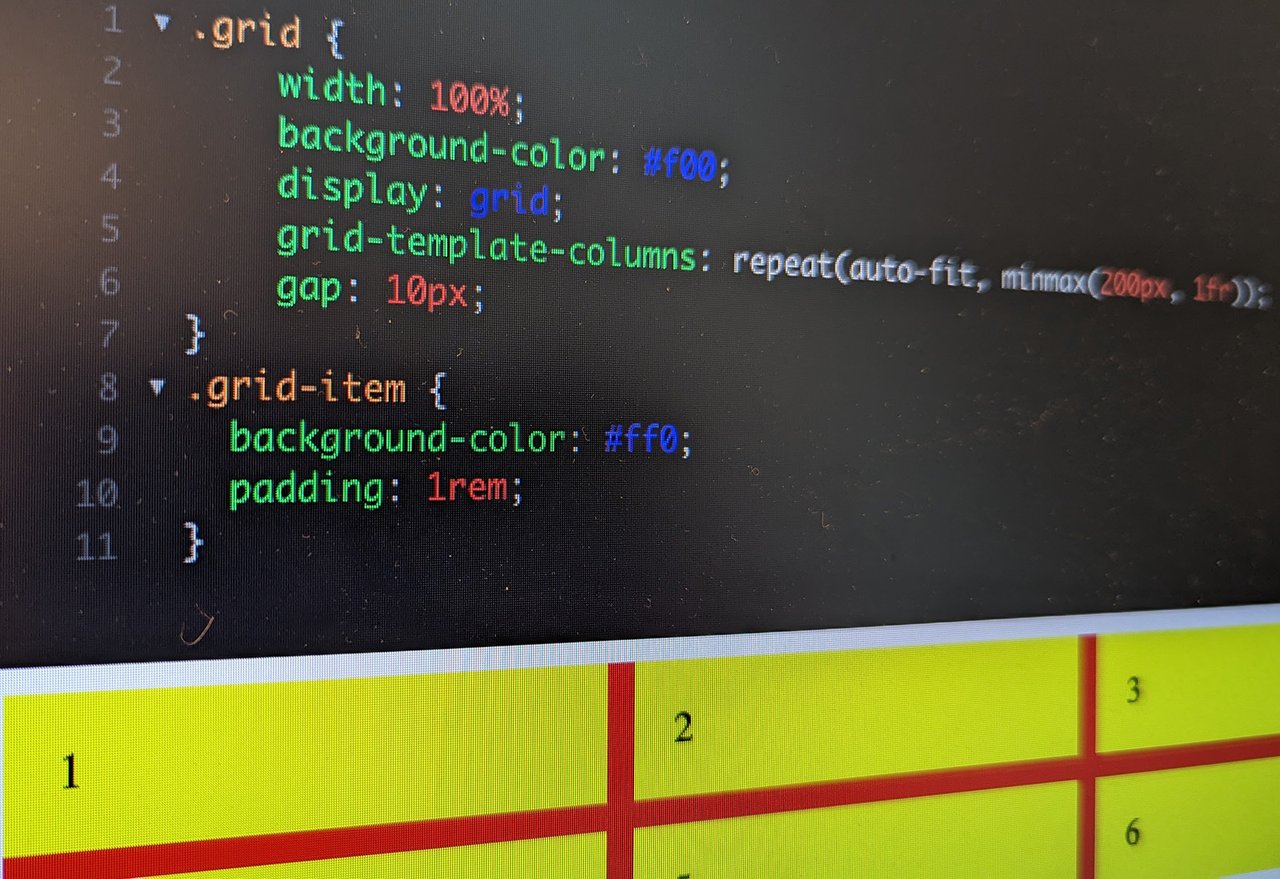
.grid {
display: grid;
grid-template-columns: repeat(auto-fit, minmax(12rem, 1fr));
gap: 10px;
}
.grid-item {
padding: 1rem;
}
The critical line is grid-template-columns: repeat(auto-fit, minmax(12rem, 1fr)), and it's worth unpacking because it encodes an extraordinary amount of design intelligence in very few characters.
repeat() tells the browser to repeat a column pattern. But instead of specifying a fixed number of repetitions (repeat(3, ...) for a three-column grid), we use auto-fit, which instructs the browser to create as many columns as will fit in the available space. The browser becomes responsible for the column count — a decision that, in a traditional approach, would be hardcoded at multiple breakpoints.
minmax(12rem, 1fr) defines the constraints for each column. The minimum width is 12rem — below this, the content would be too cramped to read comfortably. The maximum width is 1fr — one fractional unit of the remaining space. This means that once the browser has determined how many columns fit, it distributes the leftover space equally among them. Every column is at least 12rem wide and expands proportionally to fill any extra room.
The result is a grid that continuously adapts:
On a wide desktop monitor, you might see six columns. On a standard laptop, four. On a tablet in portrait orientation, two or three. On a phone, one. The transitions are seamless — there's no jarring reflow at breakpoint boundaries because there are no breakpoints. The layout is a continuous function of the available space, and the browser evaluates that function at every pixel.
Compare this with the traditional responsive approach to the same layout: three or four media queries, each specifying a grid-template-columns value for a specific width range. More CSS, more maintenance, more assumptions about device widths, and — critically — more points where the layout doesn't quite work because the actual viewport falls between two breakpoints. The intrinsic approach eliminates all of these problems by eliminating the assumptions that cause them.
Beyond Fixed Units: Viewport-Relative and Content-Relative Sizing
The Flexbox and Grid examples above use rem units for minimum sizing, which is already more flexible than pixels (since rem scales with the user's font size preference). But intrinsic web design extends further into dynamic sizing techniques that make layouts even more context-aware.
Viewport-relative units — vw, vh, vmin, vmax — allow elements to scale proportionally with the viewport dimensions. A heading set to 5vw is always 5% of the viewport width, whether that viewport is a phone screen or a cinema display. Combined with clamp(), which enforces minimum and maximum bounds, you can create typography that scales fluidly without ever becoming too small to read or too large to be comfortable:
.fluid-heading {
font-size: clamp(1.5rem, 4vw, 3.5rem);
}
This single declaration replaces what would traditionally require two or three media queries adjusting the font size at specific breakpoints. The heading is never smaller than 1.5rem, never larger than 3.5rem, and scales proportionally with the viewport between those bounds. The transition is smooth and continuous — no sudden jumps at breakpoint boundaries.
Container queries — a more recent addition to CSS, and one that Simmons and others have advocated for passionately — take this principle even further. Instead of responding to the viewport width (which is a proxy for available space), container queries allow components to respond to the width of their own container. A card component that sits in a sidebar can adopt a compact layout, while the same component in a main content area can adopt a spacious one — without any knowledge of the overall page layout or viewport dimensions.
.card-container {
container-type: inline-size;
}
@container (min-width: 25rem) {
.card {
display: grid;
grid-template-columns: 200px 1fr;
gap: 1rem;
}
}
This is intrinsic design at the component level. The card doesn't care about the viewport. It cares about its own context — how much room it has been given by its parent container. This makes components truly portable: drop them anywhere in any layout, and they adapt to whatever space they find themselves in.
The min(), max(), and clamp() functions provide additional tools for intrinsic sizing:
.content-width {
width: min(90%, 60rem);
margin-inline: auto;
}
This sets the content area to 90% of its parent's width or 60rem, whichever is smaller. On a wide screen, the content maxes out at 60rem for comfortable reading length. On a narrow screen, it uses 90% of the available width. No media query. No breakpoint. One line of CSS that does the right thing everywhere.
The Philosophical Shift
The techniques described above — auto-fit, minmax(), clamp(), container queries, viewport-relative units — are individually useful. But their collective significance is greater than any one of them. Together, they represent a fundamentally different philosophy of web layout.
The old philosophy was prescriptive. The designer prescribed specific layouts for specific contexts, and the browser executed those prescriptions. The designer was the authority. The browser was the renderer.
The new philosophy is declarative. The designer declares constraints, relationships, and priorities, and the browser resolves them into a layout that's appropriate for the current context. The designer is the strategist. The browser is the decision-maker.
This shift has implications far beyond clean CSS. It changes how we think about design deliverables (specifications become constraint systems rather than pixel-perfect mockups). It changes how we think about testing (instead of checking three breakpoints, we verify behavior across a continuous range). It changes how we think about maintenance (fewer rules means fewer things to update when requirements change). And it changes how we think about the future — a layout built on intrinsic principles will handle device categories that don't exist yet, because it doesn't depend on assumptions about specific screen sizes.
Jen Simmons's contribution, beyond the technical advocacy, is the articulation of this philosophy in terms that make its implications clear. Intrinsic web design isn't a framework. It isn't a methodology with steps and deliverables. It's a posture — a decision to work with the web's inherent flexibility rather than against it. To treat the browser as a partner rather than a rendering engine. To design systems that describe what they need rather than dictate what they demand.
The web has always been fluid. For twenty years, we built dams. Intrinsic web design is the practice of building channels instead — shaping the flow rather than stopping it, and trusting that the water knows where to go.
Photo by Carlo Alberto Burato