My HTML Boilerplate
Starting on the right foot
I recently had the need to explain to a group of students how a vanilla HTML5 page should be structured and what the minimum requirements are in order to start on the right foot.
Starting an HTML page properly means taking care of different important aspects from the beginning.
Responsiveness of the page, accessibility, and correct semantics.
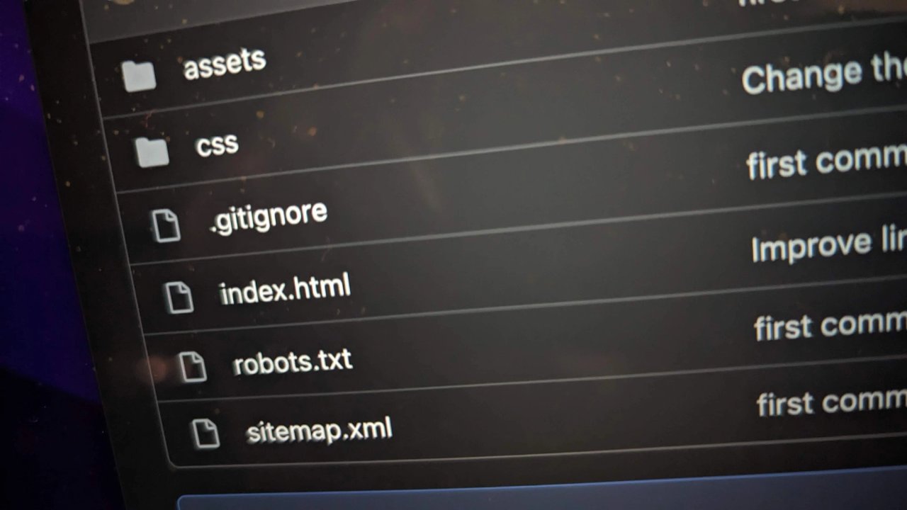
I decided to create a GitHub repository to collect the minimum code to initialize an HTML page and write this article to go through my instructions.
This repository includes an HTML5 file, the necessary CSS basics stylesheet, and also the basic configuration to allow SE robots to scan correctly the page.
<!DOCTYPE html>
<html lang="en">
The very first line is necessary to establish the HTML5 version of the document. The second line initializes the document and establishes a fallback language for the entire document, in this case, is English. This simple attribute is very relevant and indicates to screen readers the language supposed to be used during the reading.
The entire <head> section will instead look like this snippet of code:
<head>
  <meta charset="UTF-8">
  <meta
    name="viewport"
    content="width=device-width">
  <title>HTML5 - Boilerplate</title>
  <link
    rel="canonical"
    href="https://www.yoursite.com/"
  <link
    rel="icon"
    href="./assets/favicon.ico">
  <link
    rel="stylesheet"
    href="./css/reset.css">
  <link
    rel="stylesheet"
    href="./css/variables.css">
  <link
    rel="stylesheet"
    href="./css/app.css">
  <meta
    name="description"
    content="HTML5 boilerplate, start on right foot">
</head>
The entire "head" section of the document requires few but important instructions. The charset set to UTF-8 prevents a fail encode special characters. The viewport with the content set to device-width tells the document to adapt the width to the device receiving the HTML file. In this way, the document will not ignore the mediaqueries and display the content according to the instructions we provide in different size resolutions.
The title is essential for the accessibility of the document as well as for SEO. Without the title, if the page is open in a series of tabs of the browser, a screen reader can't communicate what the page in the tab is talking about. And without a title, a crawler of a search engine can't index the very first line of a search results list, the line which is most attractive for the users in order to click on our website.
The canonical tag instead is necessary for us to communicate with the search engines and instructs that the page is the official document to index, any other duplicates of this page on the net are not the original.
Although the rel="icon" might sound decorative I prefer to include it from the beginning to give the identity to the project and when the website is launched and the users save it on the bookmarks will be saved with the icon too.
The importing of the stylesheet files is, of course, essential and I normally use this sequence, first the reset.css then the variables followed by the main stylesheet, and eventually, other stylesheet files will be imported from the main file as modules.
And the description closes the head section, this is important to give additional information to search engines crawler. After the title, we can benefit from an additional one-and-a-half line (between 20 and 25 words) to describe our website. This information appears under the title of the search list result, use therefore these lines in a profitable way.
The "body" part starts with an unusual but at the same time extremely useful snippet of code: the "skip to main content" block.
<a href="#main-content" class="skip-block">
  Skip to main content
</a>
This short piece of code has to combine with the following stylesheet from the ./css/app.css file:
.skip-block {
  position: absolute;
  z-index: 10;
  transform: translateY(-100px);
  padding: 0.5rem;
  background-color: #666;
  color: #fff; }

.skip-block:focus {
  transform: translateY(0px);
}
These lines ensure both an accessibility requisite (WCAG 2.0 - 2.4.1 bypass blocks), and a good user experience during the keyboard navigation. It is also possible to bypass more than one block as in this boilerplate, for example, bypass straight to the menu or the search field.
To continue with the argument related to accessibility, I always include from the beginning another important snippet of code in my reset.css file.
@media (prefers-reduced-motion) {
  html, body {
    scroll-behavior: unset!important;
  }
  * {
  animation-duration: 0.001ms!important;
  transition: 0.001ms!important;
}}
These lines prevent any animation to run if the user has checked the "reduced animation" choice in the system preference of the computer. Notice that I use here the "!important" flag beside the property, this is probably the only occasion where I use this flag and it is because this code resides in reset.css, which is loaded as the first asset. If you are totally against using this flag you can place these lines in a separate file and load it as the last CSS asset.
Although this is not a requirement by WCAG2.0, it is a very easy adjustment that improves the experience, and the accessibility of the website, for those who suffer from PTSD (Post, Traumatic, Stress, Disorder), and often check this system preference to reduce animation and flashing on the display.
The boilerplate includes also the robots.txt file to instruct properly the crawlers of the search engines on how to index the website. In this default setting the website is crawled in its entire structure but it can be customized to avoid crawling of specific folders, by adding a couple of lines like this for example:
User-agent: Googlebot
Disallow: /private
These lines will prevent Google's crawler to index the folder /private. If you replace Googlebot with a *, then all the crawlers will not index this folder.
The rest of the index.html is represented by a simple semantic structure with a header tag, a main tag, and a footer tag.
Only one last spot I would like to highlight, and it resides inside the HTML selector of app.css:
html, body {
  scroll-behavior: smooth;
  background-color: var(--body-background);
  font-size: 100%;
}
I set the font-size to 100% here and use the rem unit in the rest of stylesheet, it means that one rem is the equivalent of 100% of 16px, which is the default value of the browsers (by the way without setting font-size to 100% per default your 1rem unit will be 16px). You can set it to whatever percent value satisfy your design, but having the value in a dynamic unit has a huge advance for accessibility. By doing this the page responds to both increased zoom percentage, and the settings of the font size to large or extra-large, which is an accessibility requirement, according to WCAG 2.0.
Happy coding!
Photo by: Carlo Alberto Burato